Taking an investment platform to the next level
Maiden Century needed to elevate their investment software, IDEA. The platform's interface and overall user experience had to keep people on IDEA and give them everything they needed, as simply as possible.
To support the changes to the investment platform, Maiden Century were also entering a new chapter. They needed a brand that could suitably promote IDEA, and a website which promoted the software clearly and slickly.


Future-proofing software usability
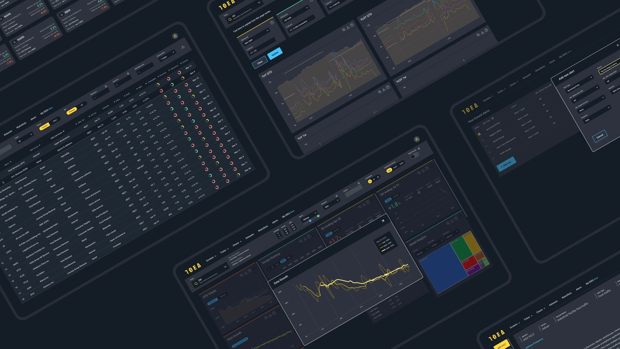
IDEA is an exciting investment software platform for investors, data scientists and vendors. The platform’s dashboard aims to reduce information overload and specialises in the visualisation of data. To continue to deliver on these benefits, we worked with Maiden Century to simplify and unify IDEA’s interface.
Firstly, a Discovery phase highlighted what we needed to achieve, and therefore what we needed to change. We started at the root, restructuring layouts, grids and user journeys across the platform. We created bespoke widgets and panels for the platform’s key touchpoints, decluttering the interface and enhancing the user experience.
Another consideration was how IDEA moved forward. We created a set of design principles that transformed the information architecture and data visualisation throughout, laying strong foundations for the evolution of the software. With this came a unified design language - typography, colour palettes, reusable icons and defined spacing throughout.
This ultimately worked towards the idea of total future-proofing, making it easier for the Maiden Century team to scale IDEA efficiently and effectively.
A brand for vibrant tech
A unified design language was also needed for the Maiden Century brand. The business had to change how they presented themselves and how their brand would look and feel to IDEA’s existing and new users.
It was established during the Discovery phase what needed to be communicated in new branding - vibrancy, assured organisation and data-led tech. The brand would be the figurehead for the IDEA product and more, so needed to be distinct yet interconnected.
We created a logo and colour palette, and selected a universal typography. The new branding took huge strides from Maiden Century’s previous brand identity, ultimately modernising alongside the ever-evolving tech market around them.
A website to drive conversions
To promote their IDEA software, Maiden Century needed a new website which encouraged potential customers to try the platform. The goal was simple yet involved creating a number of considered user journeys for a set of user personas.
Led by these distinct target audience segments, we researched, designed and built a site aimed at attracting investors, data scientists and vendors. The site managed to simply communicate a complex product, subtly but effectively funnelling potential customers to the demo page.

Ready to evolve
With this, Maiden Century had an improved software platform, and a product website and brand to form the base of their new business strategy. IDEA’s user base has continued to grow, as its software continues to evolve.
