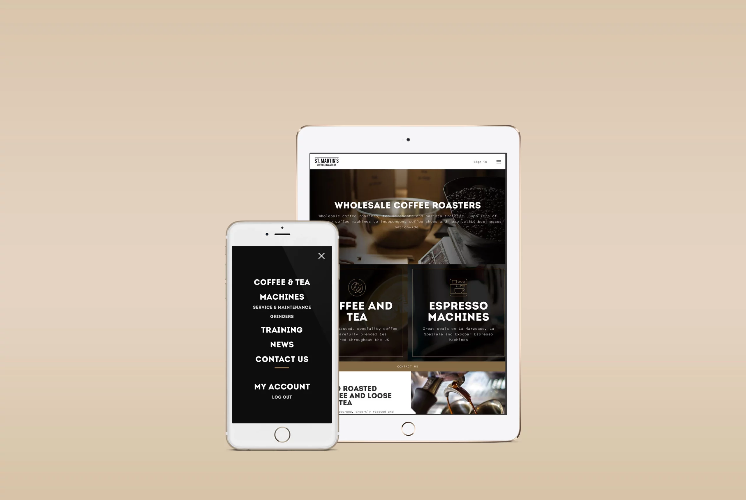
Absorbing content via mobile devices has become ingrained in our everyday life. More and more websites today are now becoming optimised for mobile and rightly so. An interesting statistic reveals how users are now consuming content via mobile and tablet devices rather than on desktop.
With this ever growing demand for mobile optimised websites, we have come up with our top tips for designing websites optimised for mobile and tablets:
Make it tangible
Present key buttons and call to actions large enough for fingers to press and try to avoid controls that are too small. Consider the ‘reachability’ of the thumb as some controls on mobile may make it difficult for the user to reach from one top corner to another.
Considered content
Deliver concise content and avoid long paragraphs of text and body copy. Large high-quality images and rich media should be used in moderation to avoid long loading times and large mobile data usage.
Accessible Context
Consider where and when the website will be used. For example; make sure the phone number of an emergency service is easily accessible without having it buried under rich content or behind menu controls.
Avoid long forms
When dealing with forms, always minimise the number of form fields required to complete a workflow. Splitting or chunking forms into digestible steps can also help hand-hold users through a complex process.
Avoid clutter
Always find ways to minimise any clutter on screen by simplifying complex controls, reducing any unnecessary visual noise, and utilising white space to help bring clarity to the content being presented.
Scannability
With the tangible nature of mobiles and tablets, users will tend to skim through content and scroll quickly from top to bottom. So attempt to highlight key statements and use visually contrasting pull quotes to help emphasise key points.
Be responsive, be ready for change
The mobile and tablet market is always changing with screen sizes either increasing or decreasing. So test routinely how a website appears on different screen dimensions and work closely with the development team to maintain how the website appears in a consistent manner across all sizes.
Other great tips are available but we believe these to be the most important ones.
Google have a quick and simple tool online to test your website: https://testmysite.withgoogle.com/intl/en-gb/. We recommended you regularly test whether your website is mobile-friendly so that you provide your customers with the best possible experience.
Here at Bulb Studios, our websites are designed and tested so they deliver the best experience on all platforms: mobile, tablet and desktop. We always thrive for interfaces to be accessible, concise and efficient.