Adopting healthier lifestyles
Living a healthy lifestyle is becoming an ever growing trend in today’s society. People are conscious of what they eat and how lifestyle plays a big factor in wellbeing.
Growth in fitness
With this changing society, the health and fitness industry has grown rapidly as businesses look to build products and services that meet the demands.
One of those products is Healthia. A joint venture between Incorpore (employee wellness benefit provider) and roadtohealth (mobile/digital health specialist).
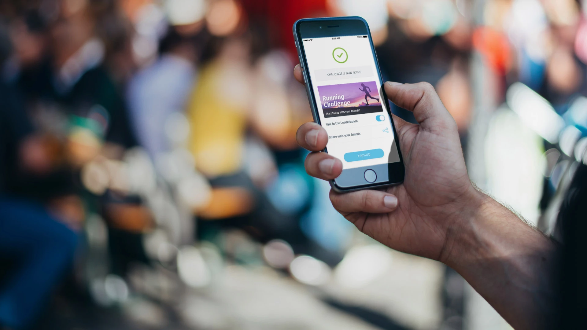
The Healthia app is the latest product for companies to encourage their employees to adopt physical activity and wellness as part of their daily lives.
Healthia has seen significant growth in the past 2 years and with national corporations coming onboard they needed a kick-ass mobile app to deliver their promise to users.
That’s when our friends at roadtohealth got in touch with Bulb Studios. We were tasked to position Healthia alongside other leading mobile fitness apps on the market.
Discovery
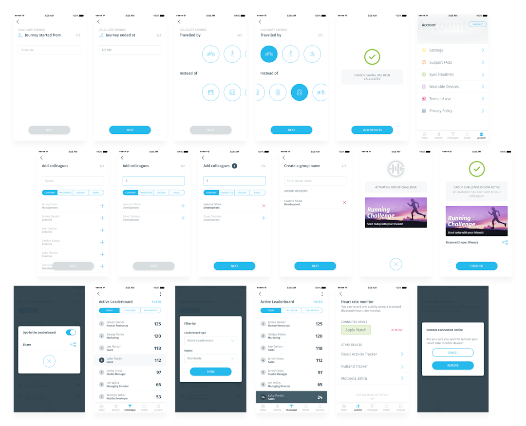
As always, we started with a discovery phase, which included dissecting our client’s requirements and understanding the motivations and frustrations of the end-users.
We produced a comprehensive market research report and a thorough audit of the existing app which reviewed the information architecture, user journeys and user flows.

Fun, Engaging and Intuitive
Those were some of the words roadtoheath used during our discovery phase.
Throughout 2016, roadtohealth met with key stakeholders at Google and Samsung who identified the importance of ensuring the UX & UI was clean, simple and intuitive for users.
We took this into account and used these words as the foundation to create an extensive design system that would allow roadtohealth to build upon.

Creative freedom
Healthia had an evolving brand and granted our team freedoms in how that can be applied within the application.
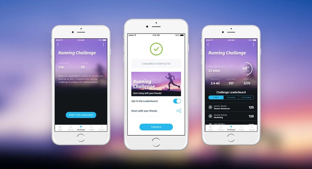
A new font, typographic scale and refined colour palette was adopted to create a cleaner, slicker interface that provided greater clarity and affordance to end-users.
Reduce user cognitive load
One main goal was to improve user interactions, so usability had to be at the forefront of all our decision making.
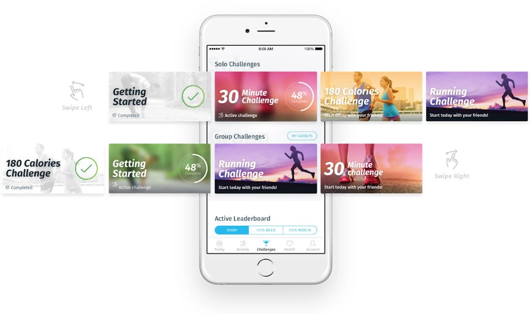
As users will predominately be using the app on the go, our designers were conscious not to require much cognitive load from users. This meant we kept the number of UI patterns and styles down to a minimum, especially when it came to interactions.
We needed to make sure interactive elements had appropriate touch areas and were clearly signposted. By using trending interface elements and gestures we made sure the UX and UI was intuitive and stayed ahead of the curve.

In Healthia we had a great concept, it was incredibly important to take the core product features and design to the next level; that’s why I brought the guys a Bulb into the fray. Their analysis and final master designs/flows ensured Healthia can be compared with some of the biggest names in the market.
John Allen
Product Director, roadtohealth
Conclusion
Our UX workflows and UI styleguide have been well received by all stakeholders at roadtohealth and we look forward to watching them grow as they look to combat issues related to physical activity and wellness.